AI Creation Platform · Information Architecture · Template Marketplace
RPGGO Creator Tool — Improving Onboarding & Resource Discovery
PROCESS HIGHLIGHTS
The problem wasn't what anyone thought it was.
When I joined RPGGO, the PM had a hypothesis: the Discover page wasn't engaging enough. I thought the data was pointing somewhere else entirely.
Challenge
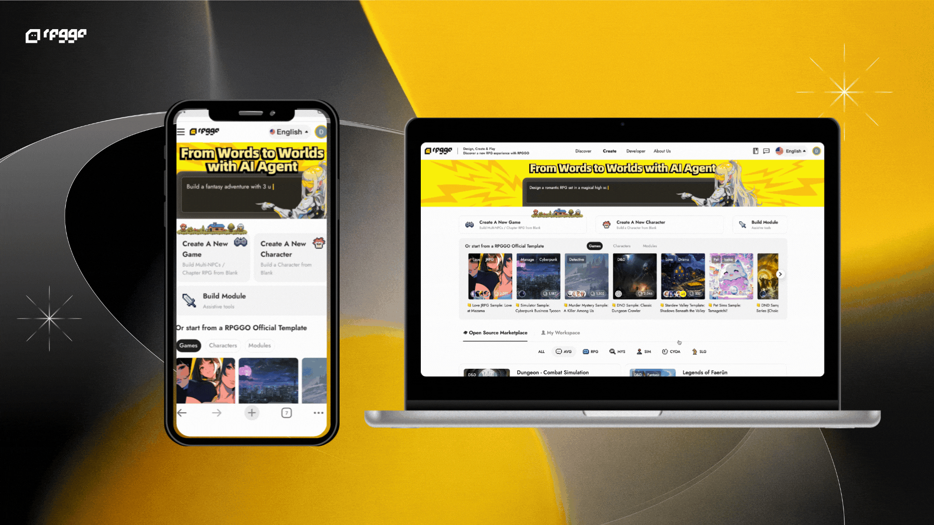
New creators landed on a game gallery with no introduction to what RPGGO is or what they could do. Those who found the Creator Tool encountered a page that felt unfinished, with no clear entry point, no way to evaluate templates, and no guidance on how to begin.
Opportunity
Redesign the entry experience around a single insight: don't ask users to create from nothing - let them build on what already exists.
Time
2024
Disciplines
Product Design
Information Architecture
Interaction Design
Responsibilities
UX Research Synthesis
Landing IA Restructure
Template Card Redesign
Marketplace UX Integration
Tools
Figma
Adobe Photoshop
Adobe Illustrator
PROBLEM
Users Were Leaving Before They Even Started
42%
Bounce Rate
of visitors left without interacting
21%
Template CTR
clicked a template
<30s
Avg. Session
for new visitors before drop-off
PRODUCT CONTEXT
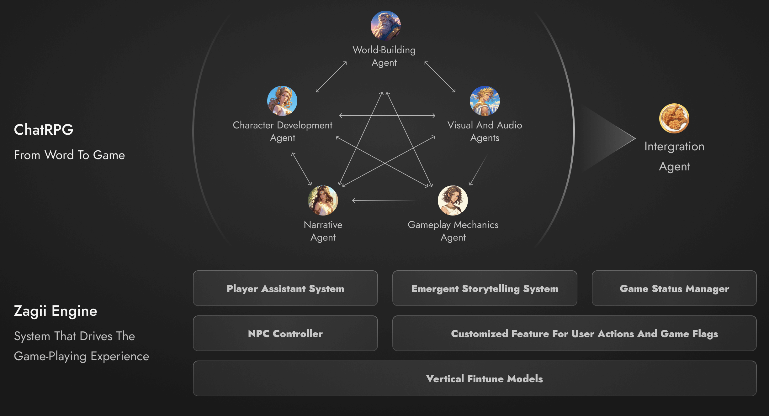
What is RPGGO?
PLAYER
Discovers & Plays
Community games & templatesCREATOR
Builds with Words
Natural language to playable RPGREMIXER
Forks & Adapts
Open-source games as starting pointsSURFACE
MY SCOPECreate
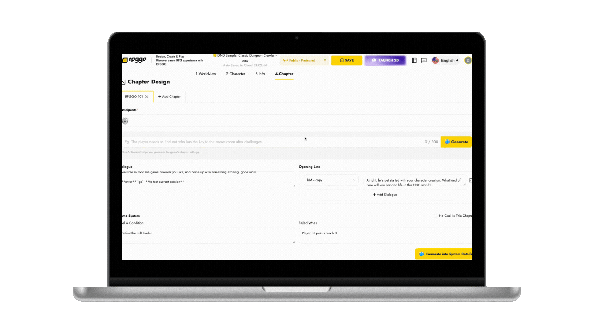
Use creator tool to build a playable RPG from a text promptWorldview → Characters → Story → GameSURFACE
Discover
Browse community games & official templatesSURFACE
MY SCOPEMarketplace
Play, fork, and remix open-source games from the communityBrowse → Play → Remix → BuildMy Role
What I owned
“Neither solution was given to me. I had to find the problem first.”
USER RESEARCH
What First-Time Creators Struggle With
I reviewed onboarding recordings, Discord questions, and internal feedback to build a hypothesis. Then I invited 8 first-time creators to walk through the Creator Tool with me, watching where they hesitated and what confused them.
"When I land on the Create page, it just looks blank and not very engaging."
"RPGGO looked interesting, but the Create page felt empty. I wasn't sure where to start, and the templates didn't help me understand what kind of game I could make."
DESIGN AUDIT
What the old page got wrong
Interview data explained hesitation; this audit showed exactly where the IA was causing it.
Login
No product context - users enter blind.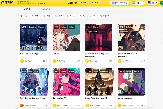
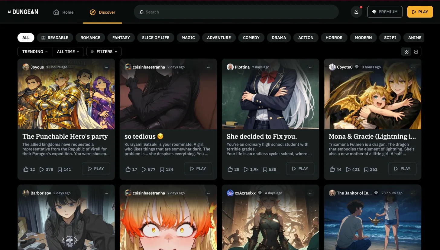
Discover - First Stop
Game gallery first, so users assumed this was only for browsing.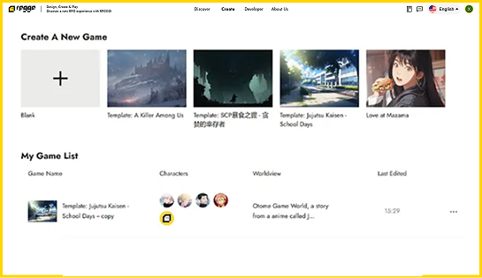
Create - Hidden
Buried in nav - most first-time users never reached this page.After login, users landed directly on a game gallery - no banner, no introduction, no signal that RPGGO was a creation tool. The only way to reach the Creator Tool was a nav tab most users never noticed.
Stakeholder Alignment
Reframing the Problem
Once the root cause was clear, three conversations shaped the final scope. Each pushed back on a different assumption - and each led to a better solution.
Stakeholder 01
Problem reframeTheir assumption
The Discover page wasn't engaging enough. Refresh it with a hero section and better-curated games - that's what was causing the bounce.
My reframe
A 42% bounce rate under 30 seconds wasn't a content problem - it was an onboarding failure. I brought the research findings to the triad and shifted focus to the Create page, where the real breakdown was happening.
→ Team aligned on redesigning the Creator Tool landing page, not the Discover page
Prioritization
Aligning the Team on What to Focus On
After stakeholder alignment, I mapped potential features against two axes - impact on new creator confidence vs implementation effort - to focus the team on the highest-leverage work.
Impact on new creator confidence x implementation effort
Template Card UI/UX
Entry Point
Category Filter
Full Web IA Overhaul
Open Source Marketplace
Character Template
Copilot Interaction Redesign
Discover Banner
Step by step Tutorial
Strategy Bridge
From Insights to Design Decisions
After prioritizing what to build, I translated research into specific feature decisions - and why I made each call.
01
User Insight
"It felt empty - is this even ready?"
Design Principle
Signal credibility through visual richness
Feature Decision
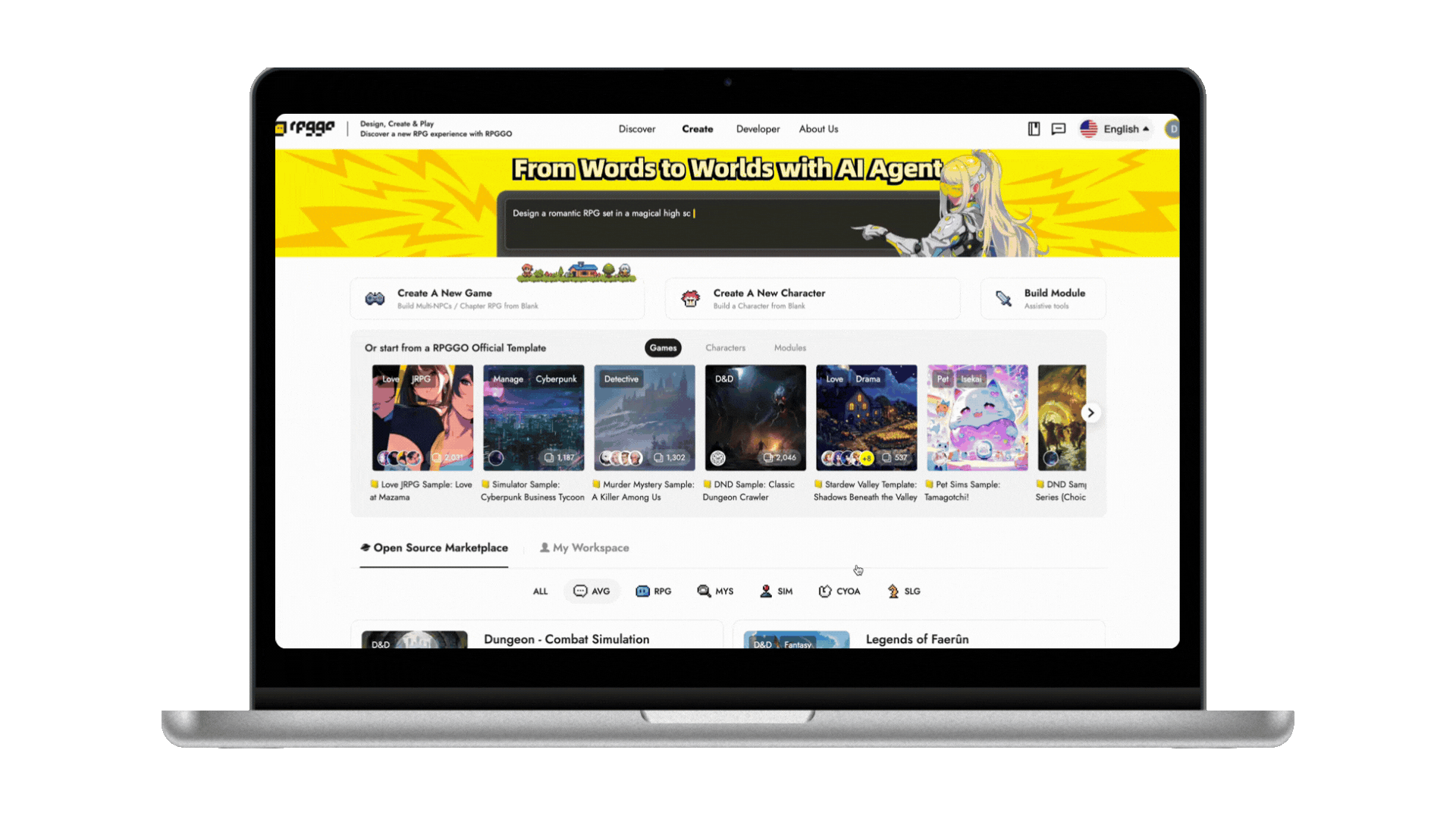
Hero section + IA restructure
My Rationale
Users weren't failing because they lacked instructions - the page signaled an unfinished product. I chose visual credibility over a tutorial first.
02
User Insight
"I thought these were just games"
Design Principle
Make purpose visible before interaction
Feature Decision
Template cards with genre tags, avatars, hover preview
My Rationale
Genre tags and avatars introduced scannable affordances before click. See Template Card Redesign for the full interaction rationale.
03
User Insight
"I want to see before I build"
Design Principle
Reduce commitment anxiety with previews
Feature Decision
Open Source Marketplace with Play & Remix
My Rationale
Marketplace lowers activation energy from zero: users can see what's possible, then build on top of it.
Final Designs
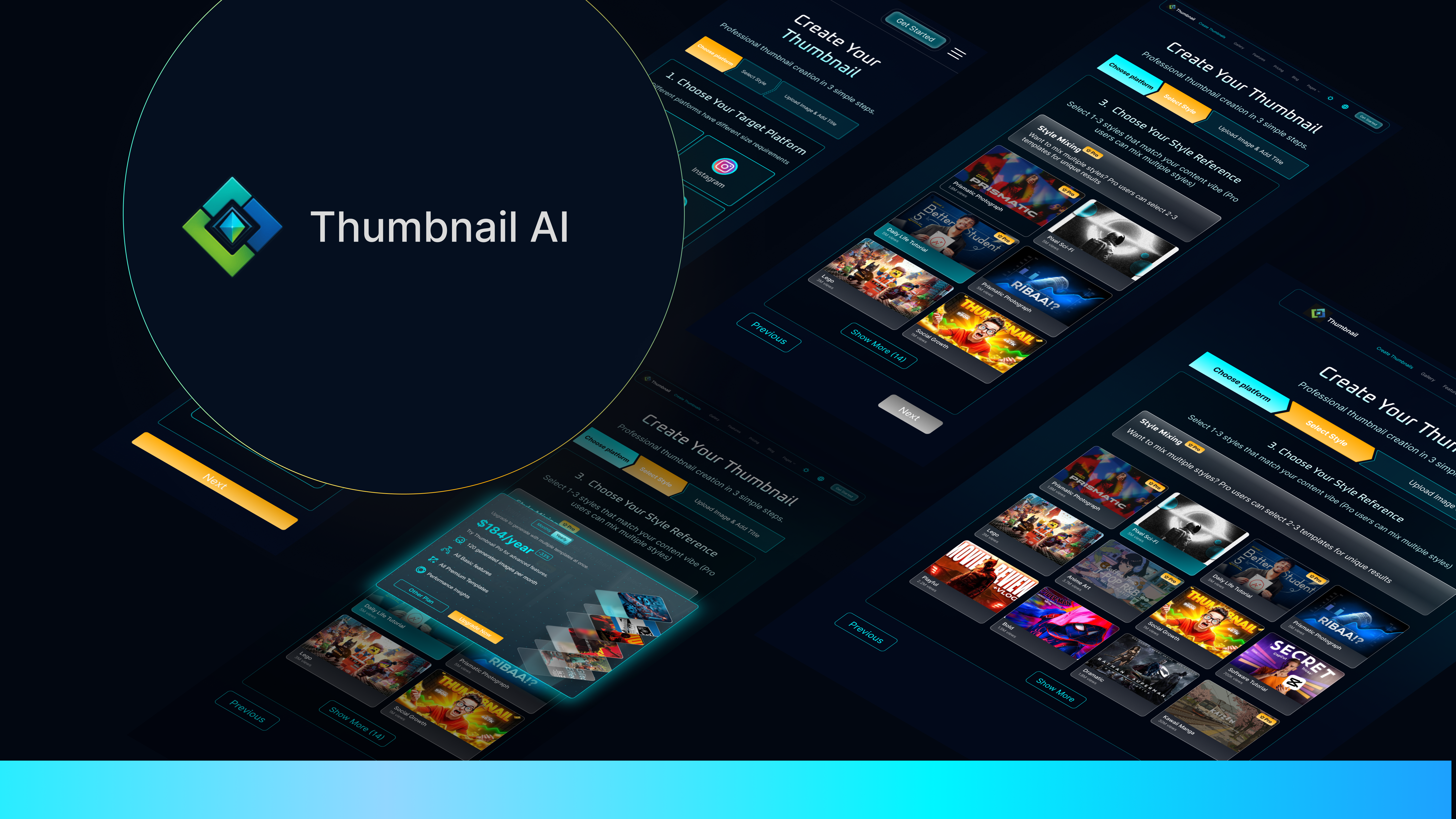
Template Card Redesign
The original template card showed only a cover image and title - no genre tags, no character previews, no usage count. Users had no basis to evaluate fit before clicking, and nothing to signal that this was a starting point, not a finished game.
Before
After
Genre tags visible at a glance - users know the content type before clicking
Character avatars + usage count preview complexity, style, and social proof
Heavy blur + "Use Template" CTA on hover reframes the card's identity from game to starting point
Design Process / Iterations
“After validating template card clarity, I scaled the same logic to the full landing architecture.”
Final Designs
Landing Page Design
Before touching visual design, I mapped out what modules the page needed to support. The old page had 2 modules with no hierarchy. The redesign needed to surface 5 distinct modules and 4 clear entry points - each with a defined job.
I noticed "Create a New Game" and templates appeared in the same visual zone. Users couldn't distinguish starting from scratch from using a template - two different intents, one container. As a result, users hesitated, misclicked, and exited before entering the creator flow.
Sketches, Prototypes, Concept Tests
Sketch 01
× RejectedSide by Side
Equal visual weight made Create and Template feel like siblings.
Sketch 02
× RejectedTemplate on Top, Create Below
Template became the hero and buried the core action.
Sketch 03
✓ Chosen DirectionCreate on Top, Template Below
Build first, then use template as a launchpad.
Sketch 04
✓ Carried ForwardMarketplace + My Workspace as Tabs
Tabbing reduced visual noise while keeping both modes discoverable.
Decision
Chosen direction: Create first, Template second, Marketplace/Workspace via tabs.The resolved layout surfaces all five modules in one scroll: Hero anchors orientation, Create and Template support initiation, and Marketplace plus My Workspace support return visits.
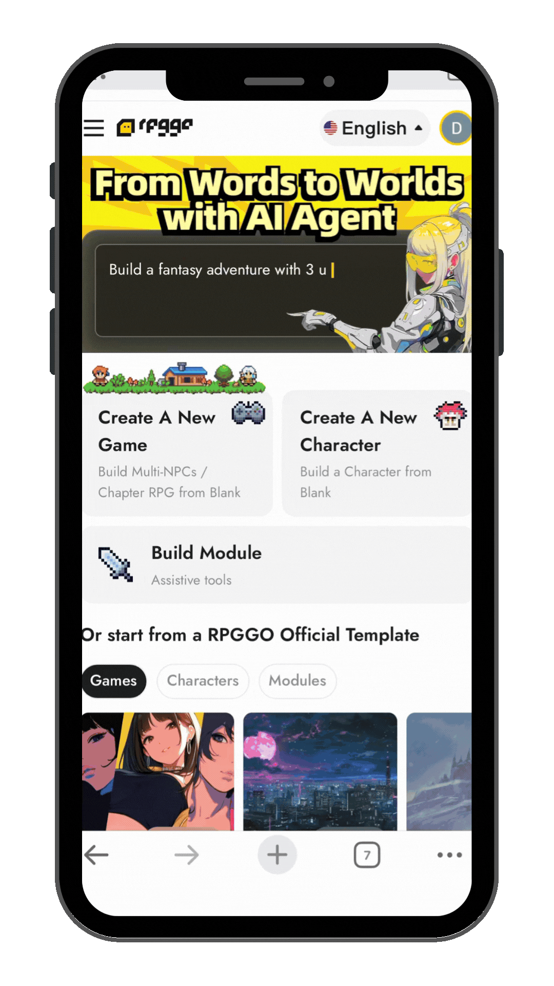
Desktop Flow
Mobile Flow
“The founder had a vision. I had to figure out what to build.”
Final Designs
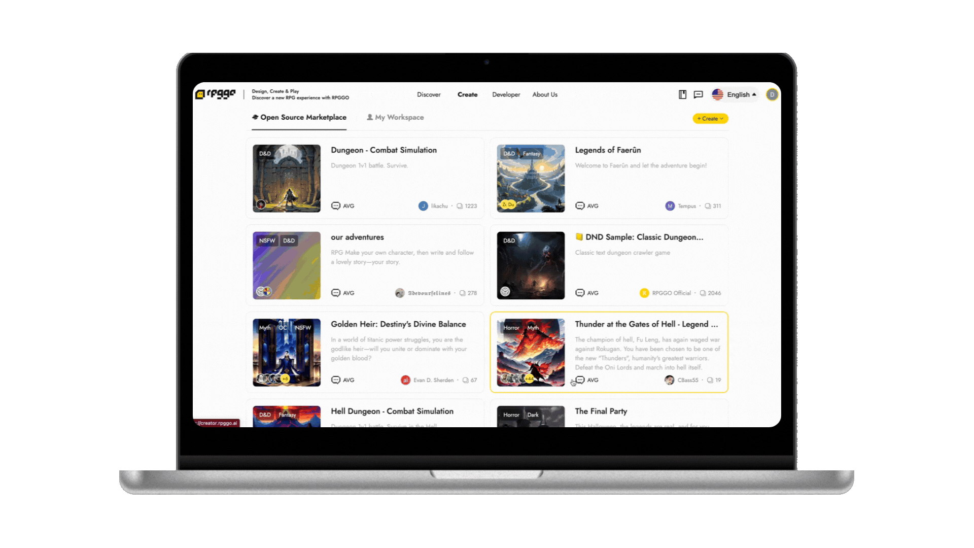
Open Source Marketplace
The landing page redesign solved orientation. The Marketplace solved commitment anxiety - giving creators a safe path from inspiration to creation.
The founder's vision was compelling but abstract. I looked at how other creative platforms lower the barrier to a first creation - across gaming, AI tools, and design ecosystems - to find a concrete model.
Roblox
Creators publish assets to a shared marketplace. Anyone can browse, acquire, and build directly on top of existing work.
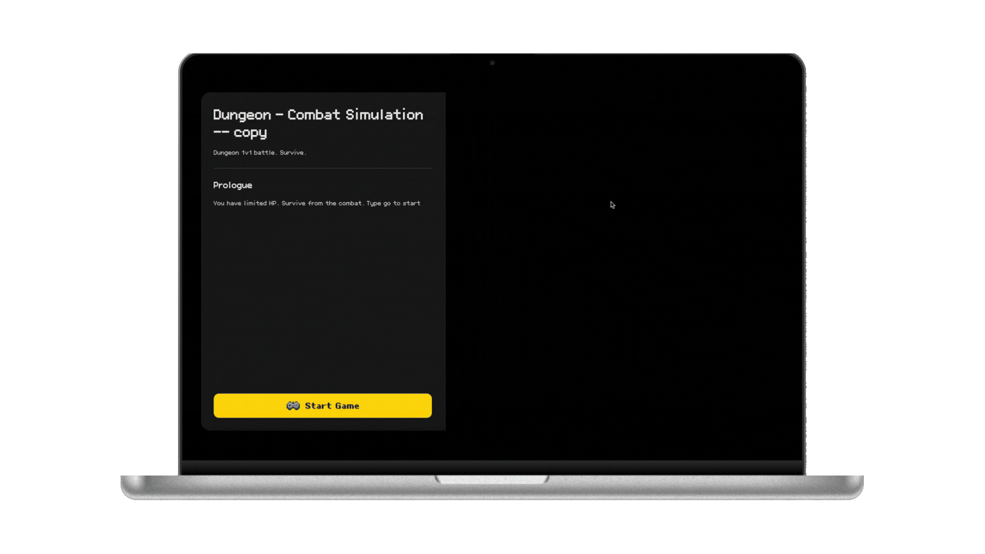
AI Dungeon
Published adventures are open to fork. Users start from a complete scenario - not a blank prompt.
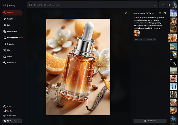
Midjourney
The community gallery exposes the prompt behind every image. Users learn by seeing the output first, then reusing the structure.
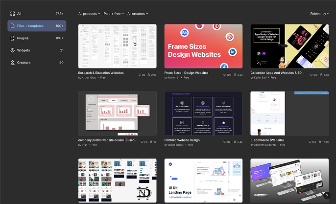
Figma Community
Finished files are open to duplicate into your own workspace. Creation starts at "edit this" - not "start from scratch."
The Pattern
Across every platform: show the finished output first, then offer one-click entry into the creation layer. None of them asks users to start from nothing.Insight
“Don't ask users to create from nothing. Let them build on what already exists.”
Lowers activation energy for new users
A completed game to fork is far less intimidating than a blank AI prompt. The first step becomes "remix this" - not "invent something."
Turns creator output into an ecosystem resource
Publishing open source creates contribution and visibility. Advanced creators lower the barrier for everyone who comes after them.
From Insight to Proposal
I brought the research back and proposed a concrete feature: an Open Source Marketplace where users explore completed games alongside the prompts that generated them - then fork directly into the Creator Tool with one click. The founder approved it into sprint.
User Flows
Design
01
PlayExperience before committing
Users can play a completed game in full before deciding to build anything.
02
Fork & RemixOne click into the creation layer
Fork directly into Creator Tool with the game's structure pre-populated.
03
Open Source or Private PublishGive creators a choice
Before publishing, creators choose Protected (play only) or Open Source (play + remix allowed).

Impact
Impact
Monthly Users
Bounce Rate
Reflection
Reflection
- The most surprising discovery was that users weren't rejecting templates - they were missing them. We assumed low template usage meant low interest, but session review showed most first-time creators couldn't even distinguish "start from scratch" from "use a template" on the original page.
- One decision I would revisit is introducing Marketplace and My Workspace together in the same release. In hindsight, I would ship Marketplace first, then stage Workspace in a second iteration to reduce cognitive load and isolate behavior changes more clearly.
- This project changed how I approach IA: now I explicitly map user intent before layout. For every landing structure, I ask "which intent starts here, and what action proves they understood it?" That question now drives module order and CTA hierarchy in my later work.
- Working on an AI product changed how I think about design itself - when the system can generate anything, the designer's job shifts from making to deciding. Every choice I made on this project was about reducing the decisions users had to make, not increasing what the AI could do.
- With more time, I would validate one concrete hypothesis: whether a "Fork & Remix"-first flow drives higher creator activation than a "Play"-first flow for first-time users, measured by entry-to-create conversion and 7-day return creation rate.