Creator Tool · Creation Flow Redesign · Monetization UX
Thumbnail AI — Structuring AI-Assisted Thumbnail Creation
PROCESS HIGHLIGHTS
The issue looked like AI quality. It was actually workflow clarity.
When I joined Holomix, Thumbnail AI was one week post-launch with around 800 early users. Some generated thumbnails looked broken, but the pattern was not random. After auditing early outputs, I found the interface was shaping the wrong inputs before generation.
Challenge
Users misunderstood key setup inputs, reached platform and size too late, and often missed Pro value during creation. The product could generate thumbnails, but the workflow did not explain what controlled the output.
Opportunity
Redesign the creation journey so users could set up the thumbnail before generation, understand what each input controlled, and discover Pro value when choosing creative options.
Time
2025
Disciplines
Product Design
AI Workflow Design
Monetization UX
Responsibilities
Output Audit
Creation Flow Redesign
Pro Upgrade UX
Pricing Page Redesign
Design Handoff
Tools
Figma
Product Analytics
Heatmap Review
Admin Output Audit
PROBLEM
Users were generating thumbnails without understanding what controlled the output.
Early usage surfaced three recurring signals — not one-off AI quality issues, but workflow breakdowns.
15%
Unusable generation
27
Title-as-prompt cases
40%
Pro value exposure
PRODUCT CONTEXT
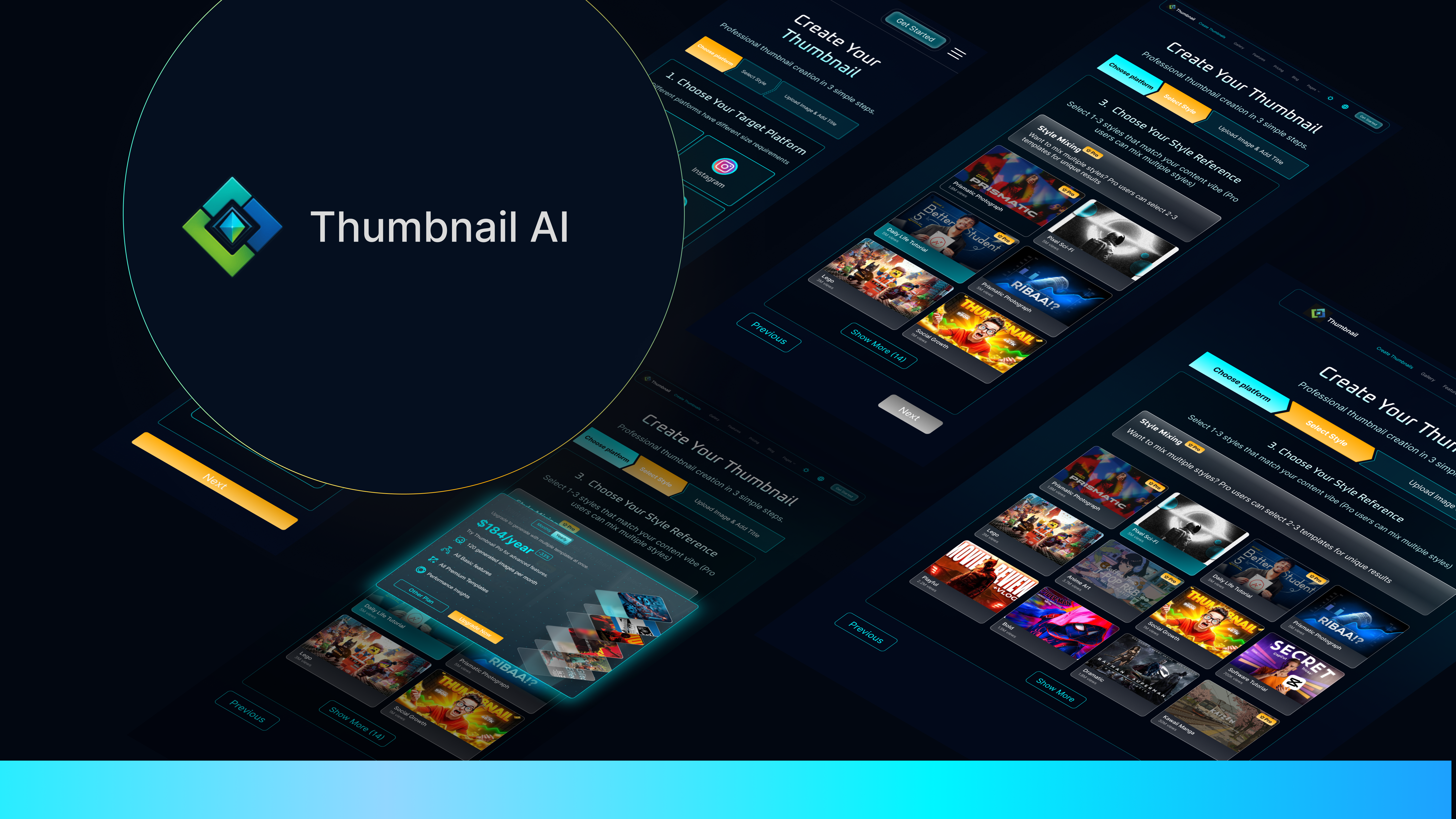
What is Thumbnail AI?
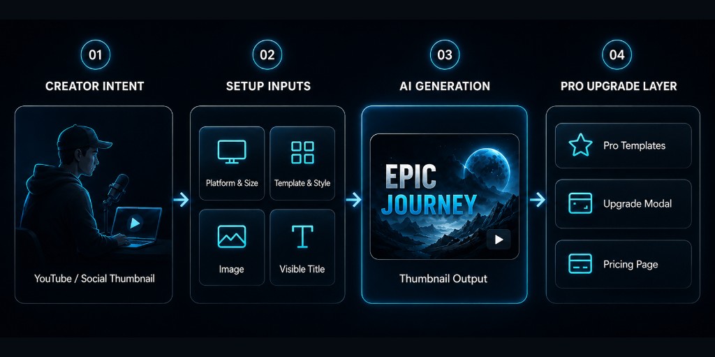
Thumbnail AI is an AI-powered thumbnail generation tool for content creators, turning platform, style, image, and title inputs into ready-to-use thumbnails. One week after launch, ~800 early users exposed where the creation workflow broke in practice: unclear inputs, unusable outputs, and Pro value appearing too late.
My Role
What I owned
I owned the UX diagnosis, Figma flows, visual system, interaction states, and V1 handoff across the creation flow, Pro upgrade experience, pricing page, and lightweight design system. AI-assisted coding was used later as a handoff layer to prototype interaction behavior after the Figma UX/UI direction was defined.
RESEARCH
Tracing the issue back to the setup flow
The signals looked separate at first. I used output audits, flow review, and creator workflow checks to understand whether they shared the same root cause.
01Output Audit
I reviewed generated thumbnails alongside backend input records — title, image, style, platform, size, and status — to understand which failures the workflow could prevent. Some “AI quality” issues were actually setup issues: users could move forward without knowing which inputs shaped the output.
02Flow Diagnosis
I mapped the original flow against what each input controlled. After the output audit, I mapped each setup input to what it controlled in the final thumbnail. Platform and size controlled framing, crop, and text space, but appeared too late in the original flow, making them feel like preferences instead of generation constraints.
- Template & StyleLow Risk
- Upload ImageLow Risk
- Enter TitleHigh Risk
Noticeably more users skim or skip
- Platform SizeHigh Risk
Highest risk before Generate
- AI GenerationMedium Risk
User could reach Generate with weak or missing constraints
03Creator Workflow Check
I checked how creators naturally started a thumbnail project. I asked three creators to walk me through how they normally start from scratch. They all started with format before style.
“I choose Youtube First because framing changes everything.”
“Before styling anything, I need to know the aspect ratio and where the title will sit.”
“Format tells me how much text room and subject space I have.”
STAKEHOLDER ALIGNMENT
Aligning the team on what V1 should fix
After diagnosis, I aligned the founder and engineer around what needed an immediate fix, what belonged in V1, and what could wait.
PRIORITIZATION
What to fix now, what to defer
I translated the diagnosis into a V1 scope that balanced creator clarity, early Pro exposure, and implementation feasibility.
FAST FIX
Input Clarity
- Title copy
- Helper text
- Examples
CORE V1
Guided Creation Flow
- Platform-first setup
- Step-by-step flow
- Required states
GROWTH SIGNAL
Pro in Context
- Pro templates
- Upgrade modal
- Pricing refinement
V1 SCOPE
DEFERRED
Post-generation Control
- Image editing
- Layout refinement
- AI adjustments
DEFERRED
DESIGN STRATEGY
From Diagnosis to V1 Priorities
The redesign focused on what users needed before generation: clearer setup, visible Pro value, and easier pricing comparison.
Insight 01
SETUP SHAPED OUTPUT
Platform · Size · Image · Title · Style
Insight 02
PRO VALUE APPEARED TOO LATE
Templates · Ratios · Advanced options
Strategy 01
GUIDED CREATION FLOW
Move setup decisions earlier
Strategy 02
CONTEXTUAL PRO UPGRADE
Trigger upgrade at high-intent moments
Strategy 03
PRICING REFINEMENT
Make plan comparison scannable
Insights
Insight 01
SETUP SHAPED OUTPUT
Platform · Size · Image · Title · Style
Insight 02
PRO VALUE APPEARED TOO LATE
Templates · Ratios · Advanced options
Strategies
Strategy 01
GUIDED CREATION FLOW
Move setup decisions earlier
Strategy 02
CONTEXTUAL PRO UPGRADE
Trigger upgrade at high-intent moments
Strategy 03
PRICING REFINEMENT
Make plan comparison scannable
Strategy: improve output quality first, then support monetization in context.
FINAL DESIGN
A guided creation journey from setup to upgrade
V1 turned the original scrolling form into a guided creation journey — with clearer setup, contextual Pro moments, and reusable states for handoff.
01Guided Creation Flow
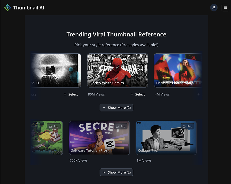
The original flow placed every setup decision in one long vertical page, so users had to understand the order and importance of each input on their own.
No clear sequence
All setup inputs appeared in one vertical page.
Required inputs felt optional
Platform, size, image, and title did not feel like generation constraints.
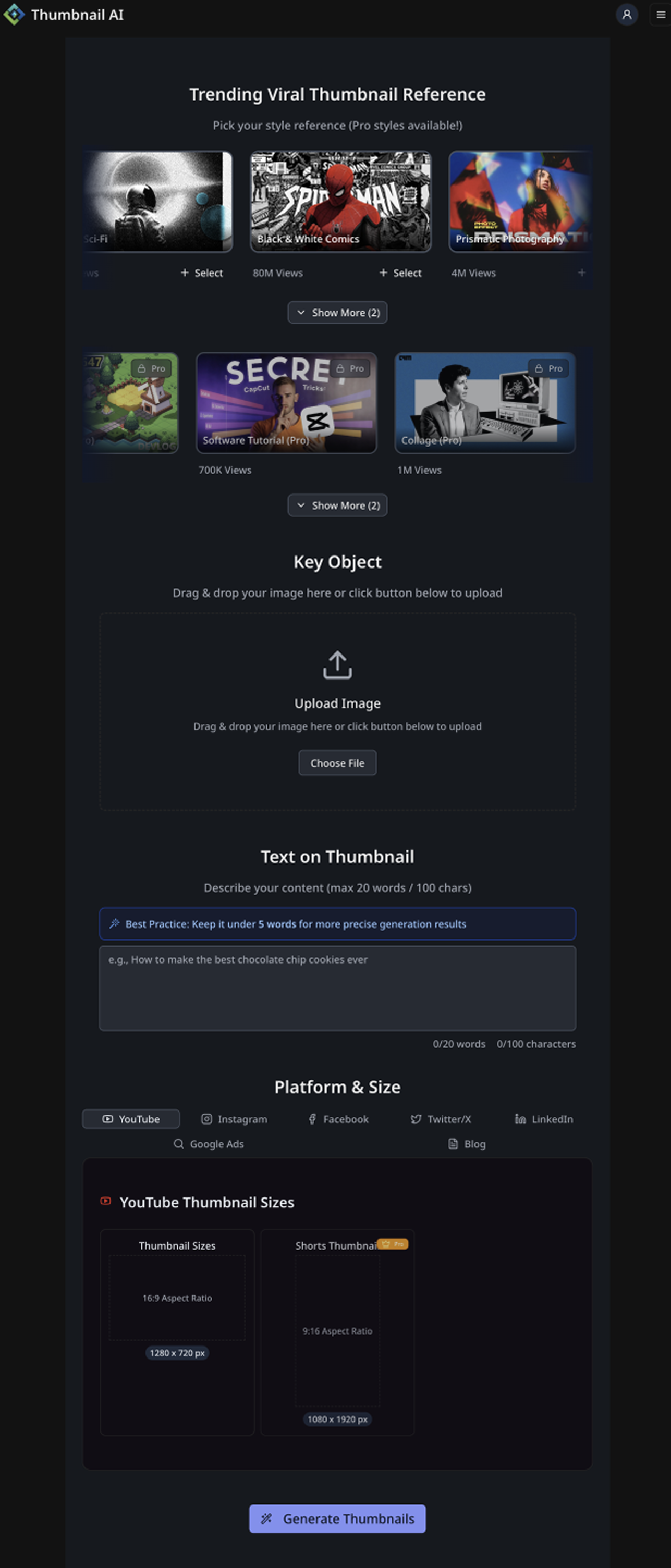
Users had to infer meaning
The interface did not clearly explain what each input controlled.
No clear sequence
All setup inputs appeared in one vertical page.
Required inputs felt optional
Platform, size, image, and title did not feel like generation constraints.
Users had to infer meaning
The interface did not clearly explain what each input controlled.
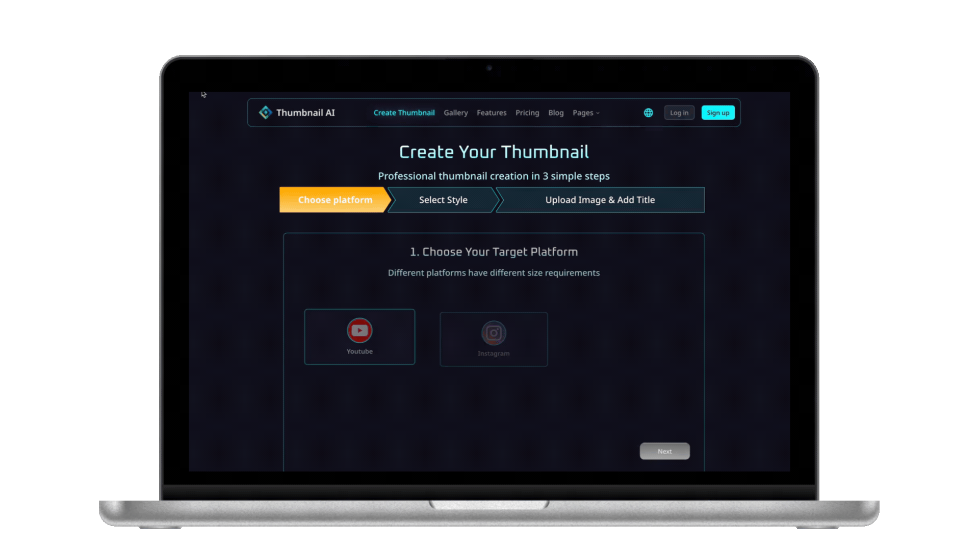
I redesigned the flow into clear steps so users could understand the product's creation logic: first define the format, then choose the visual direction, then provide the image and visible title. The step-by-step structure shortened the browsing path, reduced missed inputs, and made the generation parameters easier to understand.
Selected steps from the guided creation flow.
Final Design

02Contextual Pro Upgrade
The original template experience separated Free and Pro value into different browsing moments, so users could miss what Pro unlocked while creating. I redesigned the upgrade experience around high-intent actions — when users interacted with Pro templates, advanced size ratios, or premium creation options. The modal became a contextual explanation, not a generic paywall.
Pro value separated
Free and Pro options were hard to compare in one creation context.
Upgrade moment came too late
Users could create or browse without clearly seeing what Pro unlocked.
No contextual explanation
Locked features did not explain the value behind upgrading.
Pro value separated
Free and Pro options were hard to compare in one creation context.
Upgrade moment came too late
Users could create or browse without clearly seeing what Pro unlocked.
No contextual explanation
Locked features did not explain the value behind upgrading.
After reviewing creator tools like Canva and Suno, I noticed a common pattern: premium features worked better when users could see the value gap while making creative choices.
Canva
Intent-triggered modal
Explains upgrade after users interact with a premium element.
SunoAI creator tools
Visible locked Pro features
Shows premium features alongside free options.
Pixzelsthumbnail tools
Pricing comparison
Uses pricing to support the decision after users understand the offer.
The pattern was clear: premium value worked better when users could first see what they were trying to unlock.
Final Design
Iteration 1
Too text-heavy
Dense feature descriptions made the modal feel like a pricing page.
Iteration 2
Clearer hierarchy, still dense
Icons improved scanning, but the feature list still felt long.
Iteration 3
Too fragmented
Feature cards reduced text, but split the value into too many small pieces.
Final Decision
Simplified value list + clear CTA
The final modal prioritized quick understanding over feature density.
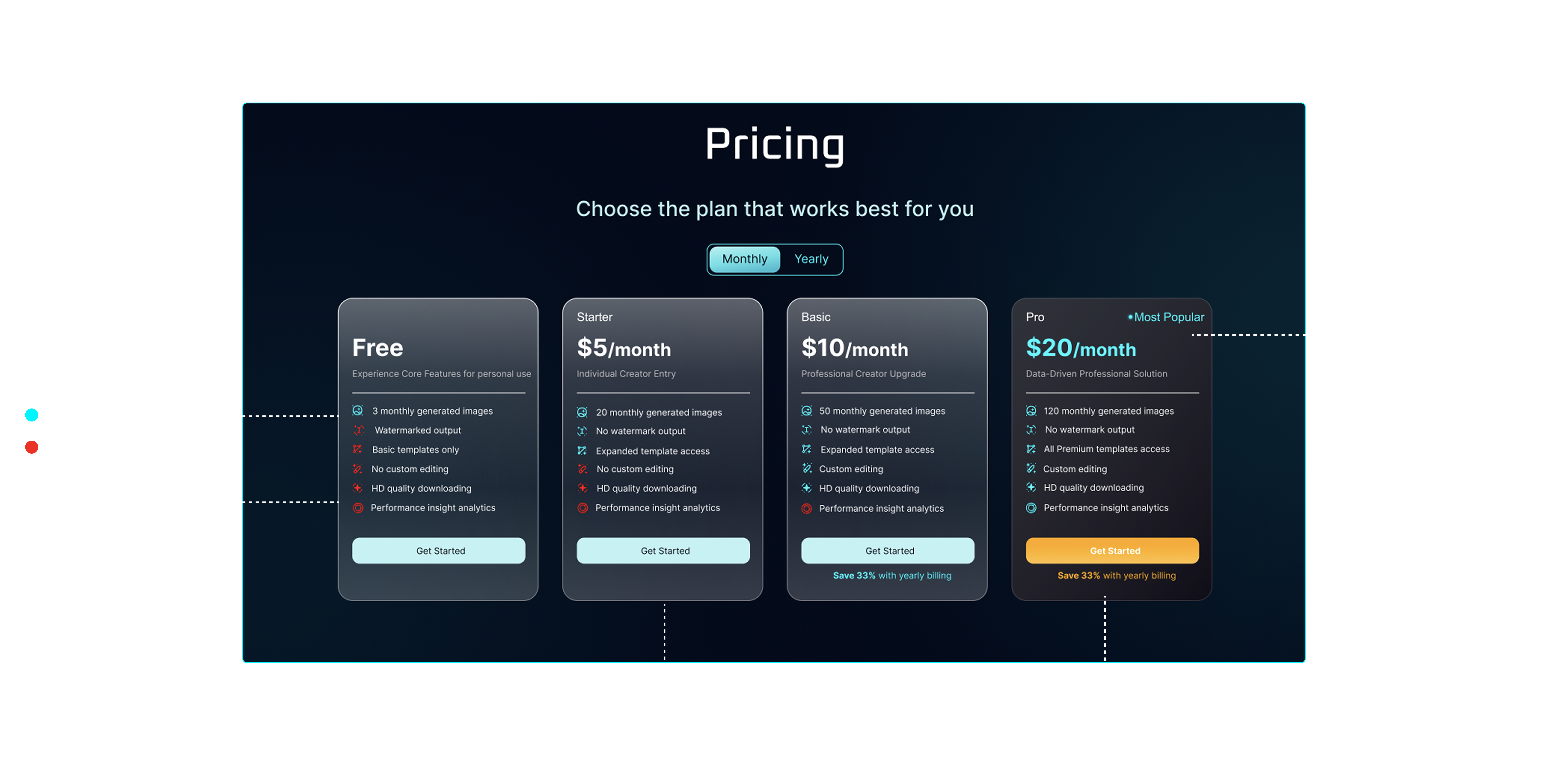
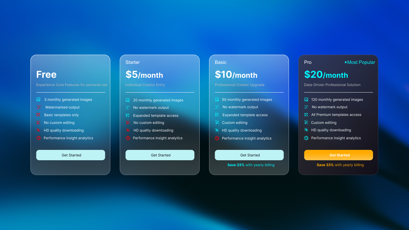
03Pricing Page Refinement
After users showed upgrade interest through Pro features, the pricing page needed to help them decide quickly. I simplified the plan cards, clarified Free vs. Pro differences, and used stronger hierarchy for the recommended plan. Pricing became a decision page, not a reading task.
Abstract feature copy
Users could not quickly understand what each plan actually unlocked.
Weak plan hierarchy
Free, paid, and Pro plans looked too similar at a glance.
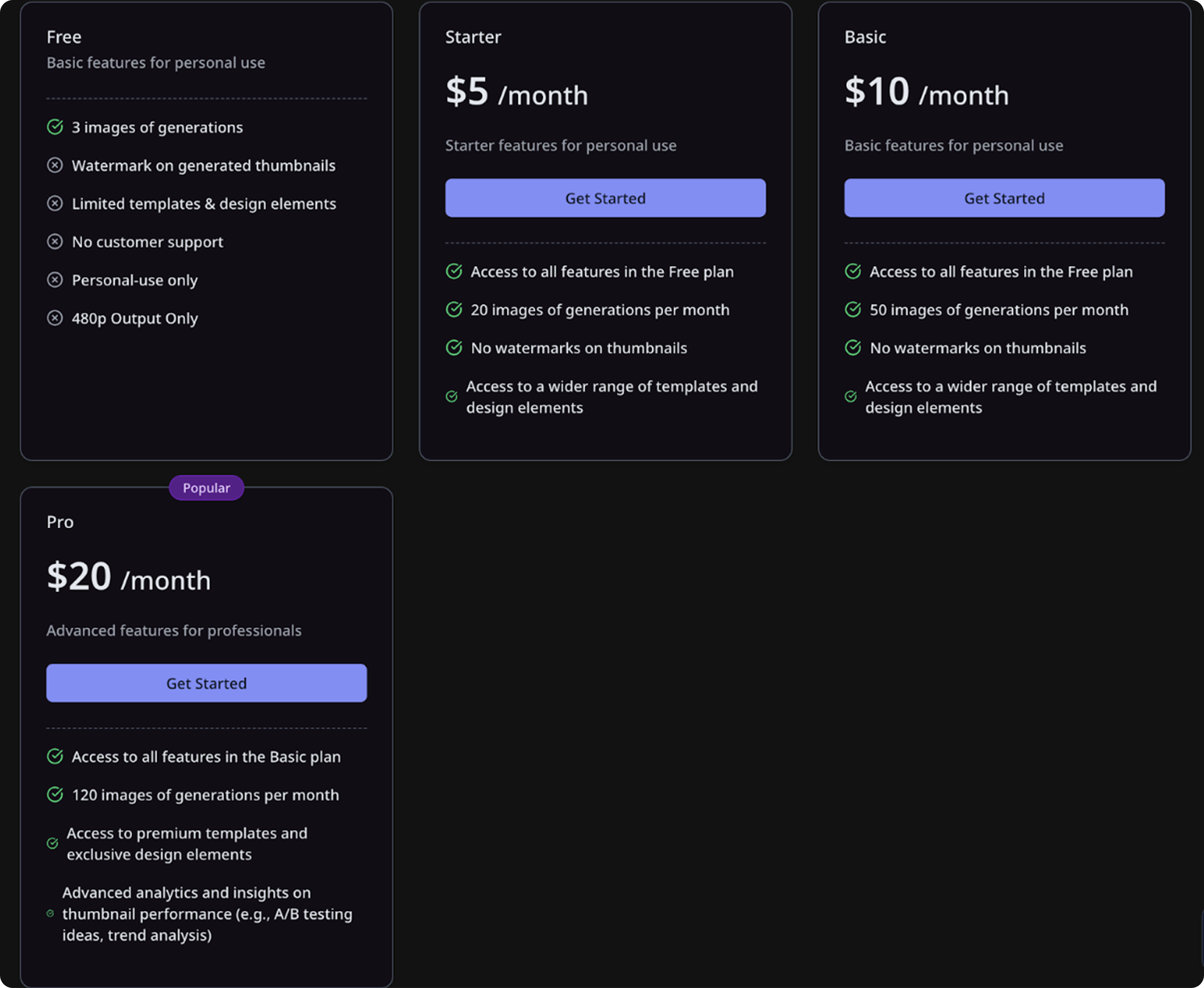
CTA lacked priority
The upgrade action did not visually stand out from other plan choices.
Abstract feature copy
Users could not quickly understand what each plan actually unlocked.
Weak plan hierarchy
Free, paid, and Pro plans looked too similar at a glance.
CTA lacked priority
The upgrade action did not visually stand out from other plan choices.
In the final design, I made plan differences easier to scan, feature access easier to compare, and the recommended Pro path more visually clear. Pricing became a decision page, not a reading task.
Final Design
IMPACT
Clearer setup. More visible Pro value.
Within four weeks of the V1 release, Thumbnail AI reached 44K+ MAU. I treated that growth as broader release context, while the clearest design signals came from fewer unusable outputs, higher Pro exposure, and clearer upgrade intent.
Output quality
Unusable generation rate
15%
Before6.1%
AfterFewer preventable output issues after setup guidance.
Pro discovery
Upgrade exposure
40%
Before87%
AfterMore users encountered Pro value inside the creation journey.
Input clarity
27 title-as-prompt cases → no repeated pattern observed in the next two weeks
Conversion signal
1% → 1.92% paid conversion among Pro-intent users
REFLECTION
From static screens to buildable behavior
After defining the UX direction and designing the core flows in Figma, I used AI-assisted coding as a handoff layer — not as the source of the design. The goal was to make interaction behavior easier for engineering to understand.
The demo helped clarify step transitions, required states, Pro modal triggers, pricing toggles, and edge states that were hard to communicate through static screens alone.
AI helped communicate behavior faster, but the product decisions, visual system, and interaction logic came from the design process.
Figma UX/UI design
Interaction behavior demo
AI-assisted coding used only for demo buildout
Engineering handoff
01Define behavior
Mapped step transitions, modal triggers, and required states before prototyping.
02Document edge states
Clarified disabled, selected, locked, loading, empty, and error states for V1.
03Support handoff
Used a lightweight interaction demo to reduce engineering ambiguity.